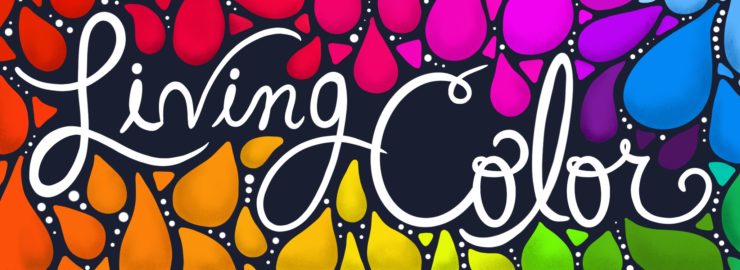
As an artist, color is an important aspect of my creative process and something I pay attention to very closely. While the advertising world, including social media, is saturated with color trying to draw consumers in, each color has been carefully thought out with a specific purpose in mind. Every brand is trying to grab the reader’s attention one Pantone color at a time. While Pantone Matching System seems like something reserved only for production and design nerds, it plays a huge role in brand identity, fashion, home décor, and personal identity.
In this modern age, I think we take color for granted sometimes. Years ago, black and white TV and photography were the norm. Now that we have the technology, color is everywhere and very much at the forefront of advertising campaigns. Brands like KitchenAid, Le Creuset, and Hydroflask use trendy colors to sell their product. Wouldn’t those products be so boring if they only sold them in white?

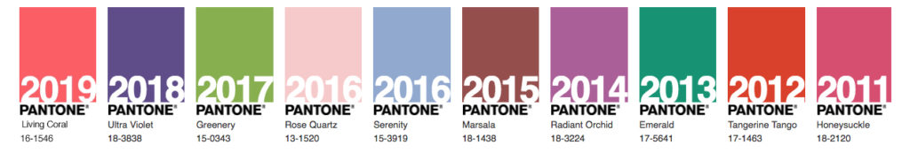
When thinking about color, of course Pantone comes to mind. The color swatch flip books are the primary tool that all designers need in order to match colors on screen to how they will print and look in person. Every year, Pantone comes out with a new color of the year which is chosen through current trend analysis. Current trends could include events going on during the year such as sporting events, red carpet events, fashion shows, socio-economic conditions, current social media trends, and the list goes on.
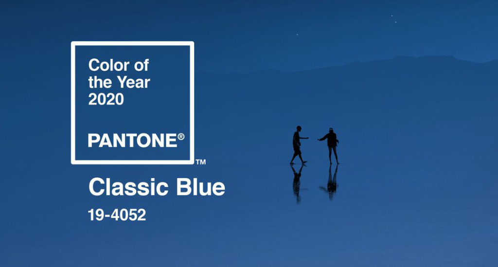
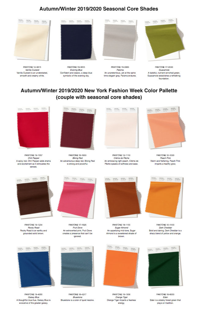
Pantone has even taken a step further by predicting upcoming color trends. For example, they are projecting colors for autumn and winter 2019/2020 to reflect boldness and confidence whether that be in fashion or any other type of design. The 2020 Pantone Color of the Year was introduced in December and it is called Classic Blue. It is definitely a rich, bold color that has, so far, been described as solid and dependable.
So, what does this all mean for people who aren’t in design or print production? Many people find that color is a part of their personalities and can even reflect their lifestyle. For example, I find that I feel the most comfortable and powerful wearing black. It has been my color for such a long time that I gravitate towards new clothing pieces that are black and I have to force myself to check out the other colors available in that piece before I buy; otherwise my closet would be entirely black! Color researchers say that that black symbolizes power, strength, mystery, discipline, and extremes (all or nothing mind set).
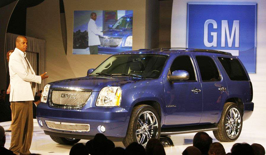
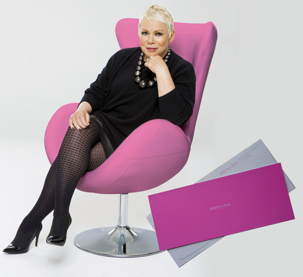
Although the cost of buying your own Pantone color is very high, there have been two people to purchase a Pantone color and they own the rights to that color. The funny thing is, the color value will never be disclosed, so it is virtually impossible to copy. Jay-Z created and owns a Pantone color that looks kind of like a metallic, pearl, cobalt blue. He then had a custom Cadillac Escalade painted in this very color. Blue symbolizes authority, structure, dependability, loyalty, and living by your own rules and by your own truth. Sounds like Jay-Z making up his own rules! The second person to purchase a color is real estate CEO Sherry Chris. She chose a hot pink color and prints all of her stationery in this color. Pink symbolizes love, affection, and serenity. When someone is buying property, pink would make them feel loved and cared for and that it takes the stress and chaos out of the buying process. If you have the time and the money, you can sit down with the Pantone professionals and choose your color. They start by having you bring in an object in the color that you like. They then generate hundreds of potential swatches for you to choose from. Once a color is chosen, you would then receive swatch samples, a CMYK generated value so it can be printed, and a unique number in the Pantone catalog (private of course!).
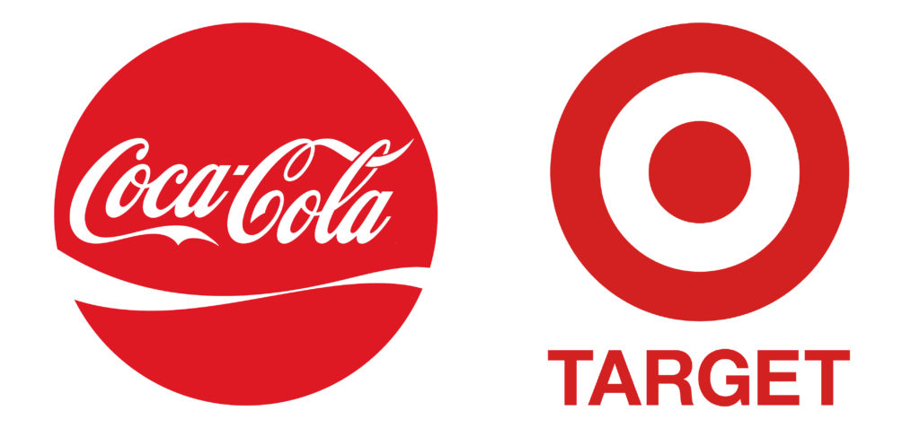
Now, another question arises when thinking about rights to a certain color. How do companies protect their rights to their brand color? There has been a lot of legal gray area when it comes to color rights and ownership. If every company owned their color and no one else could use that color, the world would simply run out of colors and there wouldn’t be enough to go around. As it stands now, companies can only protect their color under a trademark within their direct product group. So, for example, Coca Cola is known for their red packaging. Another soda company can not use their exact red for their own packaging but Target Stores, for example, could use that red for their branding because a soda company and a super store are two different types of companies. There would be no confusion for consumers between the two companies and there is no competition between them.
If you’re not an artist, an interior designer, or a millionaire who can spend money on your own custom color, you probably don’t pay that much attention to the significance behind every color you encounter and you might feel like you don’t even play a part in the color world. Remember that scene from The Devil Wears Prada when Miranda Priestly (Meryl Streep) chews out Anne Hathaway’s character, Andy, for not seeing the difference between the two blue belts during their fashion run-through? She explains the entire process of designers choosing colors and styles that are on trend at time and how many people’s jobs and livelihoods depended on this “stuff”. Although Andy felt exempt from it all, she too played a part in fashion by making the decision to buy the lumpy, cerulean sweater she had on. You definitely do not want to be the color-ignorant Andy in that situation! It just goes to show you how color really does run our world and the consumer market.
After doing my own research on color symbolism, color selections made by companies in their branding, people’s clothing choices, and even the colors I tend to gravitate towards make so much sense now! It’s like getting inside the heads of others and seeing what they are truly trying to evoke to those who are paying attention. I’m looking forward to future color trends and finding out the 2021 Pantone Color of the Year – what do you think it will be?
0 Comments
Leave a Comment