Towards the end of 2018, two major companies announced brand refreshes: Dunkin’ Donuts and Weight Watchers. Even though these brands are on opposite ends of the health spectrum, there are several similarities between their choices and the factors that influenced their desire for change.
From Dunkin’ Donuts to Dunkin’
While doughnuts will still be a priority, there is an overall food trend towards healthy, affordable options. By recognizing this gap, I expect that Dunkin’ is getting ready to position itself as one of the few fast food spots for a healthier breakfast. The beginning of a new year means health resolutions for many people. By cleverly rolling out their refresh on the first day of the new year, everyone on the “new year, new me” kick could begin distancing themselves from donuts both through intake and name association.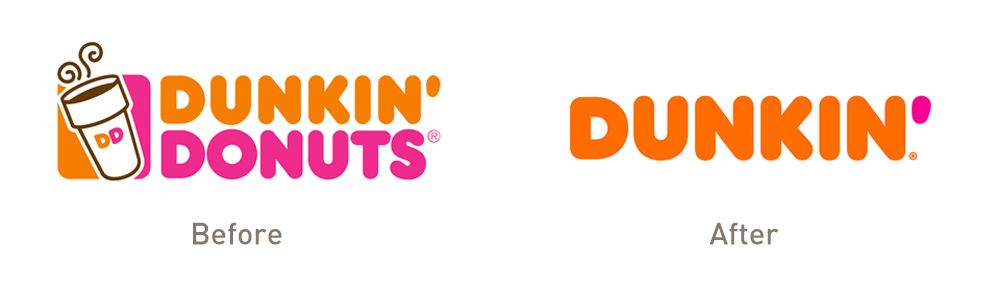 Dunkin’ did retain two of its most important design elements: colors and fonts. Preserving some of the brand’s most recognizable nostalgic components is important to keeping the brand relevant across generations.
From Weight Watchers to WW
Weight Watchers literally dropped the weight by rebranding as an overall wellness organization. With a simple WW for a name and the tagline “Wellness that Works,” Weight Watchers is able to begin offering new products and experiences that go beyond food. Wellness can come in many forms – from weight loss to mental well-being – so there is a lot of room for growth. It also frees the brand from any negative word associations, since watching weight conjures up the fears that come with dieting.
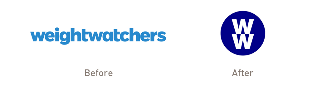 Unlike Dunkin’, WW took a different approach by choosing a completely new brand identity through it’s name, logo, fonts, and color palette. This method relies on stronger ad campaigns so that consumers make the connection that it is still the same brand, but with a new philosophy. This allows current users to grow with the company while also attracting a new set of people who might not have been interested in the brand before.
Simplify to Diversify
By paring down their names, both companies are actually able to expand their offerings. For Dunkin’, slashing the Donuts means new and different food options. A shortened name is also representative of the speed and efficiency that customers have come to expect when ordering at this fast food chain. For WW, a more comprehensive approach to their image allows for a larger target audience and a more positive influence in everyday life. For modern-day brand refreshing and re-branding, oftentimes less is more.
0 Comments
Leave a Comment