
I have always been a fan of loud, bright colors. Despite that, I was a little skeptical when Pantone announced that the color of the year for 2018 is Ultra Violet. Maybe I am just plagued by memories of a certain friendly dinosaur. Violet is not a color frequently used in marketing, fashion, and other design industries. So why did Pantone choose a color that would probably be seldom used by professionals?
With a little further research into the color, it became clear that Pantone had actually made a very smart decision. As the unofficial ruler of the color world, Pantone has a duty to bring attention to and create colors that are usually overlooked. Violet is that balancing act of a color – between red and blue, hot and cold, strong and calm. It is the missing puzzle piece to a world filled with an oversaturation of primary colors that have a simple underlying meaning. The complexity of Ultra Violet allows designers to create a voice that hasn’t been heard much before.
Using Ultra Violet in your marketing
Smartfish works with several brands in the food & beverage industry. We have seen bold and bright colors and patterns trending on packaging and marketing materials for several years. Color is one of the most vital components to evoking certain feelings and meanings in these designs. As a graphic designer, I work with Pantone colors every day to ensure continuity across a brand. Since Ultra Violet is such a different color, many brands will have difficulty incorporating it into their collateral. My guess is that it will be used more for smaller pieces like Facebook ads and event announcements. I also foresee Ultra Violet being used as an alternative to eye-catching colors such as red and yellow. Whether it is used predominately or as an accent, integrating Ultra Violet is sure to breathe new life into a design.
Incorporating Ultra Violet in your daily life
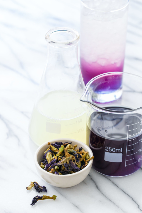
Rather than simply buying a mug, paint color, or accessory with the Pantone Color of the Year, you can impress your friends with a fun drink. What’s happy hour without trendy cocktails? Since this bright color is not commonly seen in foods, Ultra Violet-inspired drinks will need special ingredients such as ube (purple yam), butterfly pea flowers, and crème de violette. As a gin lover, my favorite Ultra Violet cocktail is The Artist.
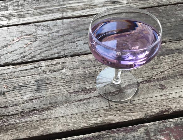
There is a fun drink for the designated driver too: Magic Potion tea, which is sold through David’s Tea. Thanks to “magic” ingredient butterfly pea flowers, this berry-flavored tea brews dark blue. When a squeeze of lemon is added, the acid reacts to the flower and the tea becomes violet-hued. Science!
Here to stay?
Overall, I have convinced myself that Ultra Violet is a welcome addition to the Pantone universe. While I still have trouble envisioning a frequent use for the color beyond specialty brand items (I’m looking at you, Sephora), I do enjoy the idea of a novelty color pushing the boundaries for designers like myself. Let us know below if you think you will use Ultra Violet in your branding!
0 Comments
Leave a Comment